MLS Quest set out to gamify the fan experience - turning match moments into collectibles, challenges into rewards, and casual viewers into invested participants. As part of the design team at Sweet.io, I led concept development across brand design, marketing, and the collectible icon system - building consistent badge hierarchies, card tiers, and progression indicators that bridged MLS's established branding with the energy of a game-like experience. The result was a cohesive visual language across product UI, badge systems, collectible cards, and marketing, scalable across ongoing seasons and campaigns.
Design that made the game feel personal — and the rewards feel earned.
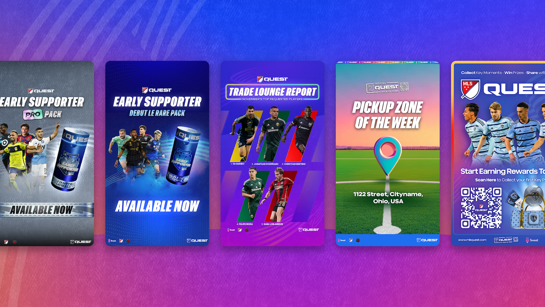
Cracking Packs,
Built for the Stadium.
Each pack is rendered as a cinematic 3D object and staged on the MLS Quest field. Tier, campaign, and edition are signaled through color treatment, typographic weight, and badge application — designed to feel like collectible merch, not a digital drop.
Key Play & Achievement Badges
Two distinct badge families anchor the MLS Quest collectible system. Key Play badges — bold gold hexagonals — reward specific on-pitch performances. Achievement badges unlock through fan participation and platform milestones.
The Badges
Make the Card.
Each card captures a real match moment — but it's the earned badges stamped onto it that tell you how rare the moment is. I designed the badge rarity system that drives this hierarchy: five tiers, each with its own palette, finish, and pairing logic. The rarer the moment, the rarer the badges it wears.
Every badge shares a hexagonal silhouette — but the material, lighting, and palette shift across tiers to signal progression. Pink holo for entry. Deep blue for Limited. Magenta chrome for Epic. Violet & teal for Heroic. Gold & crimson at the apex.
Pairings on each card are intentional: the tier badge always appears first, followed by the Key Play or Achievement that earned it.


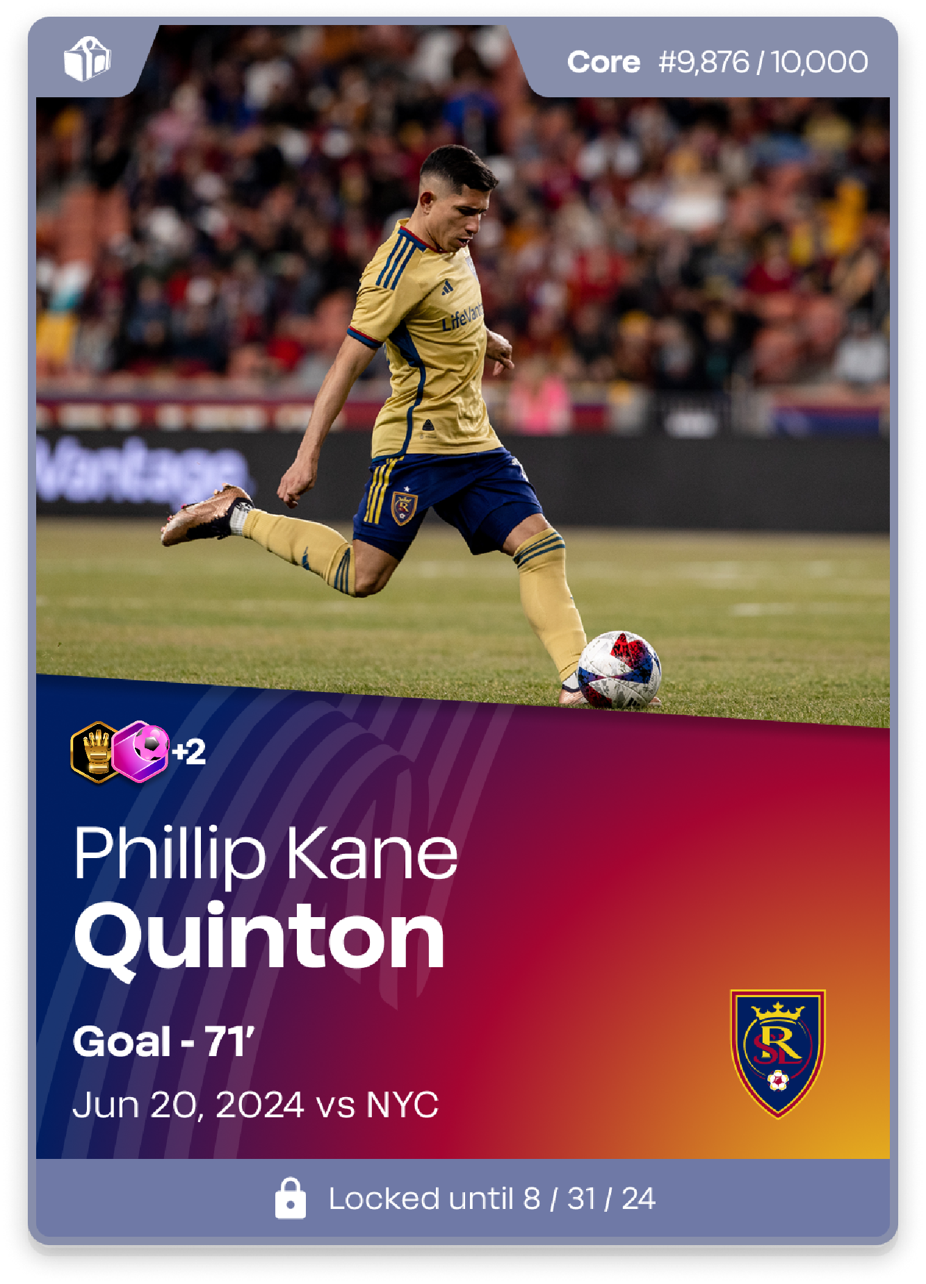
Core Edition
Muted slate frame, time-locked availability, pink holo entry badge. The gateway into the MLS Quest collection — high print run, broad accessibility.
A Visual Language
Built for Growth
The work across MLS Quest helped establish a scalable visual system that could grow with the platform season over season — from badge drops and card tiers to campaign graphics and product UI.
By keeping the design culturally grounded in soccer fandom while pushing the collectible experience forward, the team built something that felt genuinely new: a gamified fan product with real craft behind every visual decision.
Scalable by design. Rewarding by intent.
Core Team