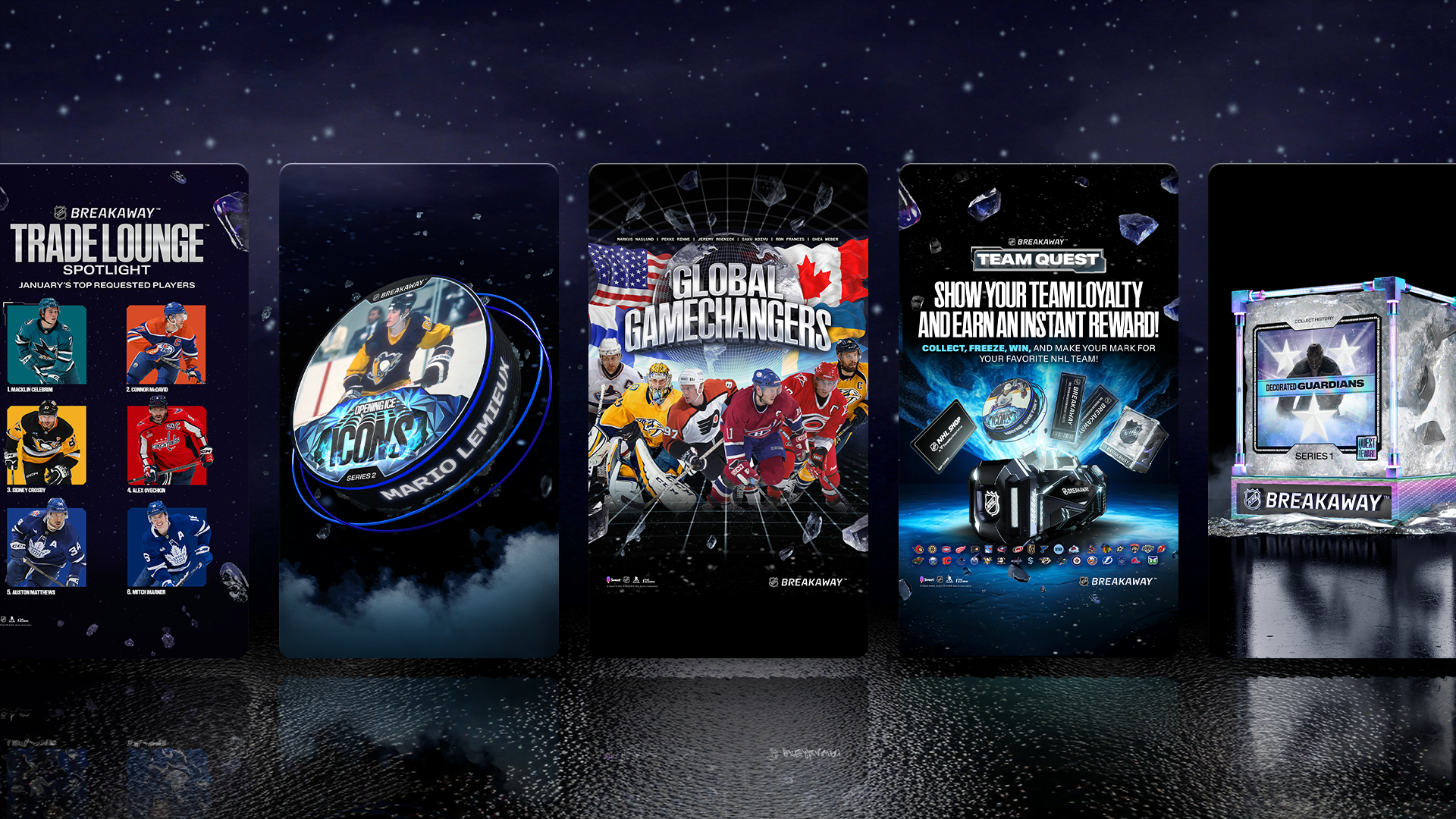
The early digital collectibles market was a minefield of visual inconsistency, and the opportunity with Breakaway was to do the opposite: build something that felt legitimately NHL - polished, premium, and accessible to mainstream fans. As a lead designer, I owned key workstreams across brand, product, and motion, shaping the visual language of the platform and driving consistency from product UI to marketing to content drops. The result was a cohesive, scalable design system across multiple seasons and campaigns.
The goal was legitimacy — a platform that felt collectible, not crypto.
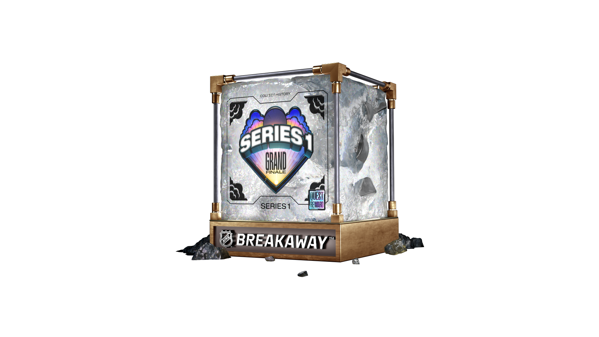
Series Design System
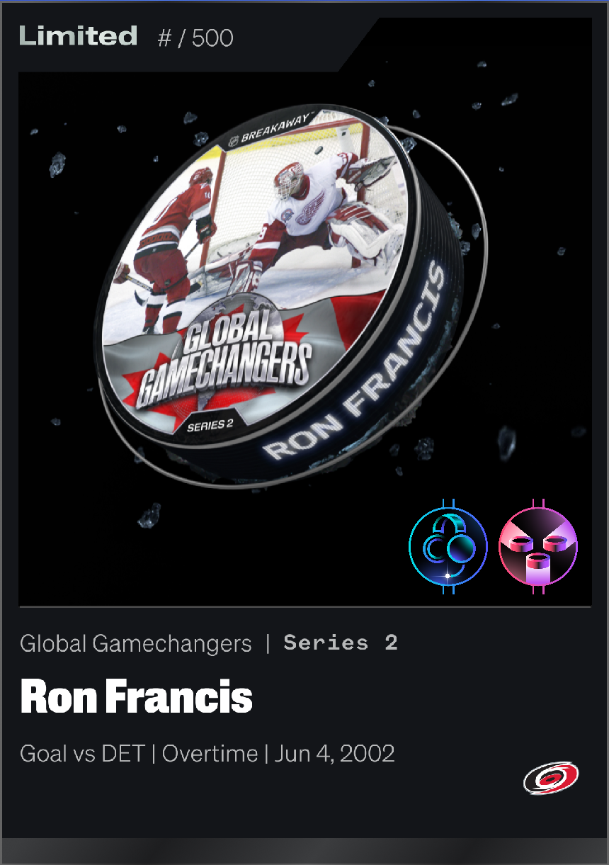
Each series required a unique visual identity — applied consistently across the pack design (the product container) and the puck artwork (the collectible itself). These designs anchor the entire gamified experience.
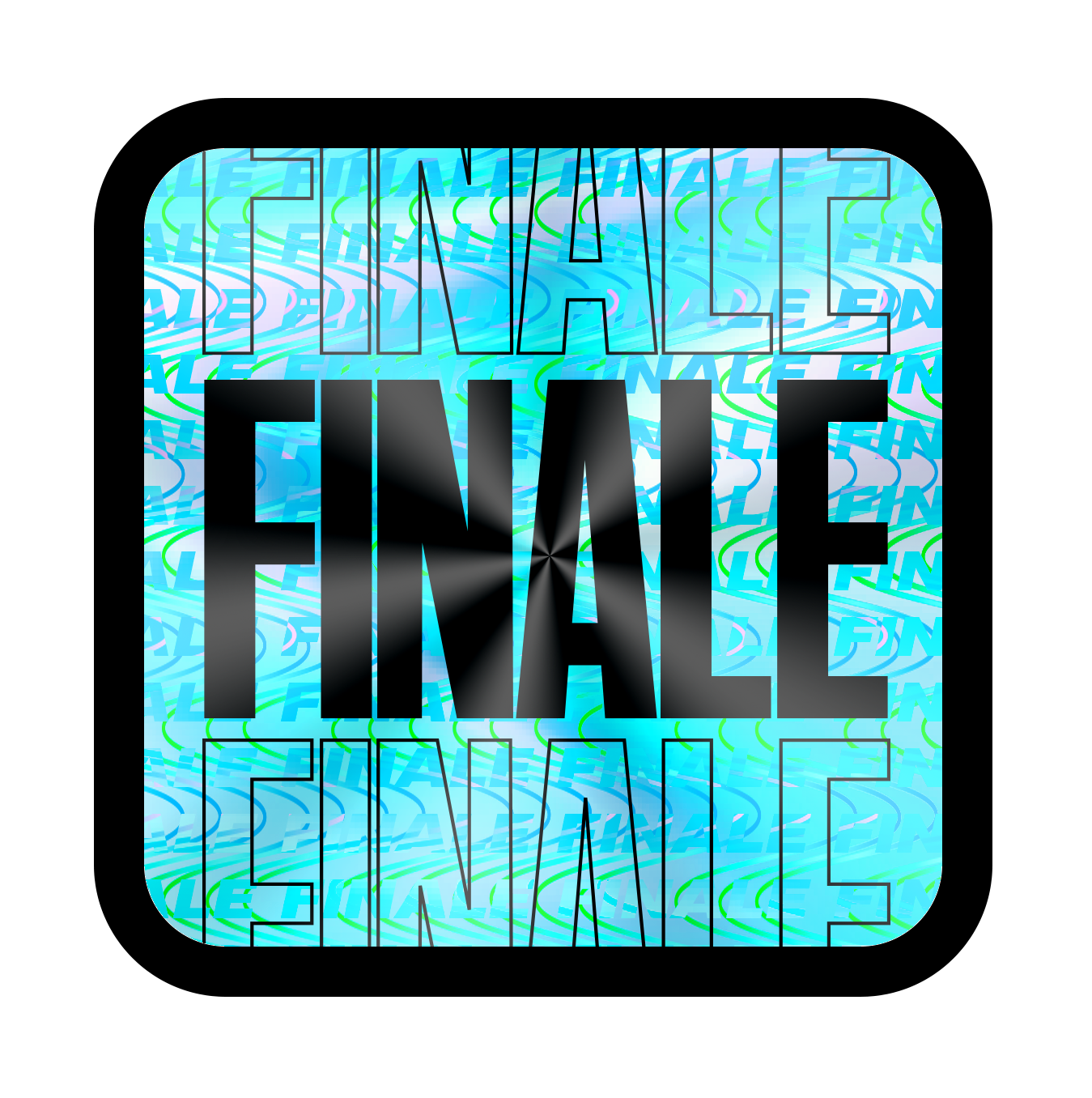
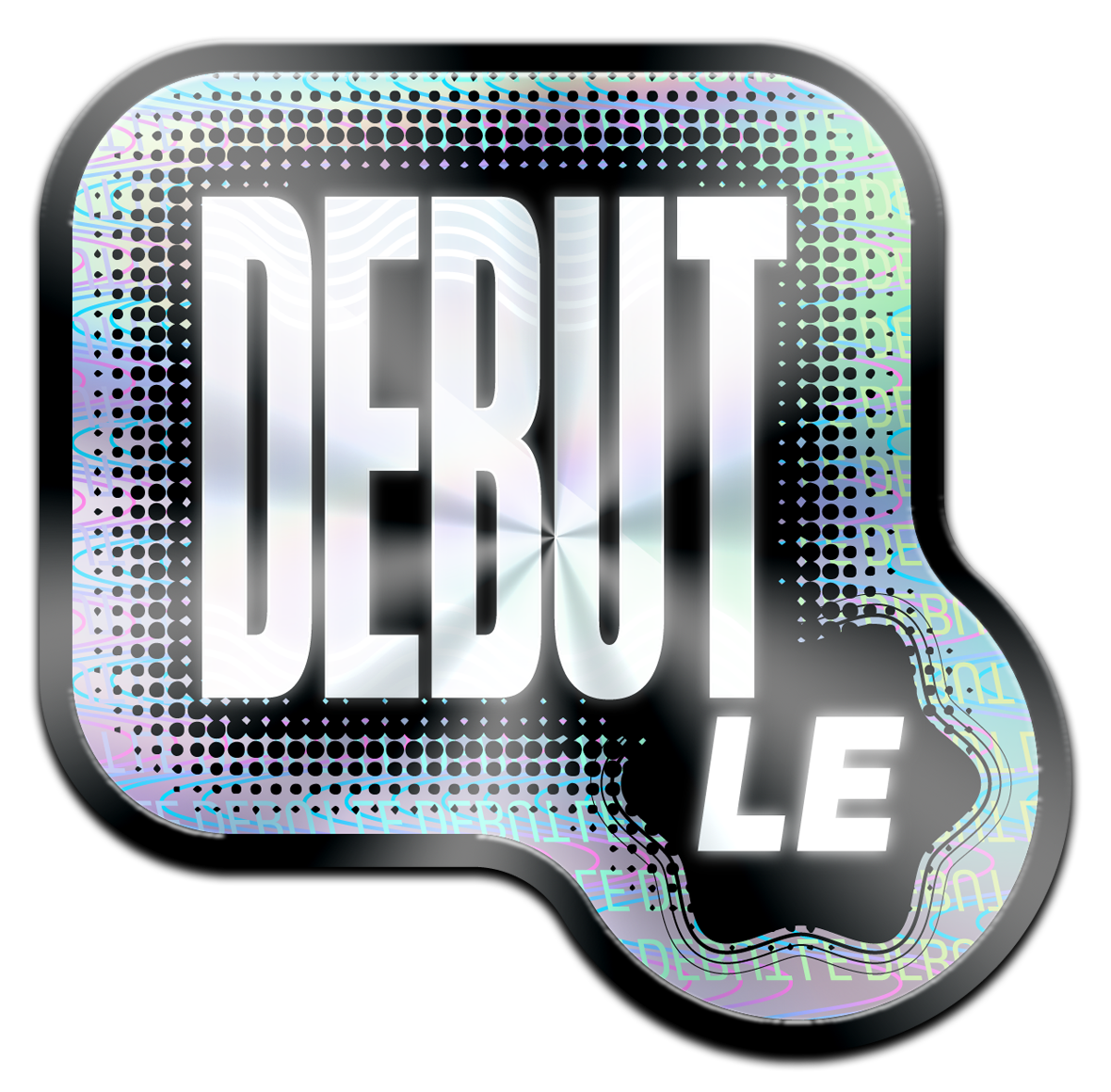
Stickers as
Series Signals
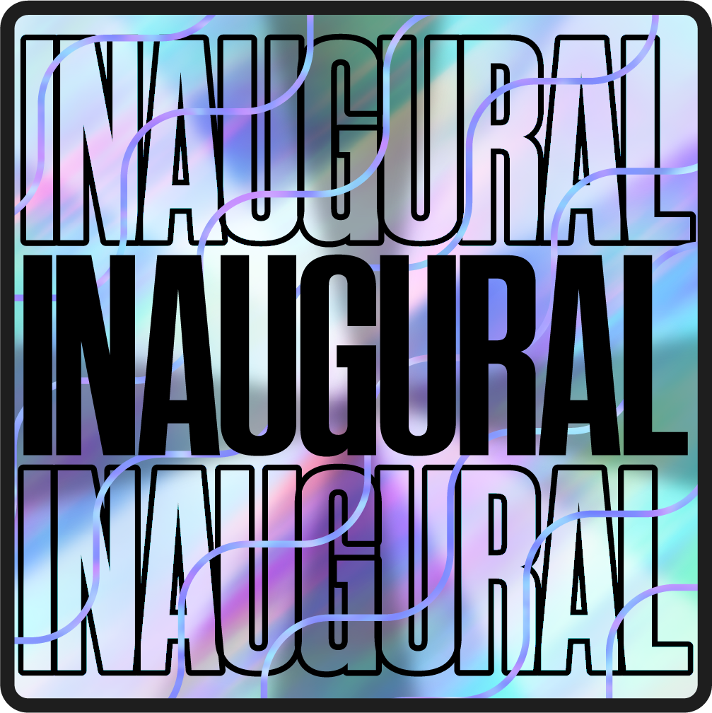
Each pack carried a holographic sticker telling collectors exactly what they were holding — a debut drop, a final window, a monthly release, or an inaugural series. Small details that added real meaning to the collecting experience.

Badge Rarity
System
A System Built
to Scale
Together, the team shipped a cohesive, flexible design system that held up across multiple seasons, drops, and campaigns — without losing visual coherence or brand integrity.
Breakaway stood out as one of the more polished products in the sports collectibles space: premium-feeling, accessible, and distinctly NHL. The system we contributed to gave the team a strong foundation for long-term growth, with clear conventions that reduced design debt and accelerated production with each new content cycle.
Polished enough to feel official. Flexible enough to grow.
Core Team